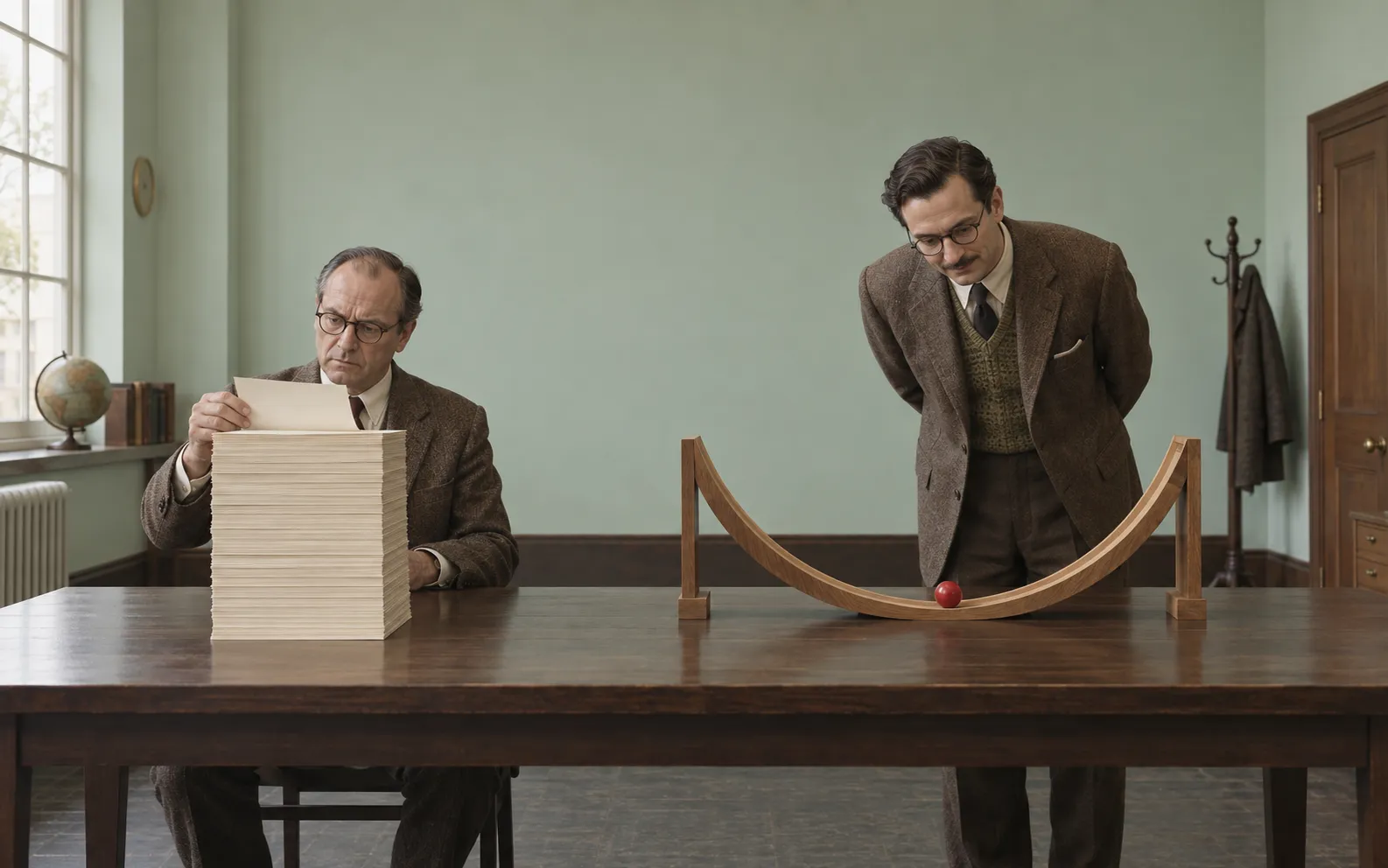
Civilisation has produced an odd ritual: someone explains something, we fail to understand it, and they explain it again using more words. Eventually there are twelve paragraphs, three footnotes, and a sentence beginning “Put simply” that should be investigated for fraud. Then somebody draws a small diagram on a napkin. Everyone understands. The napkin receives no academic credit.
Andrej Karpathy recently offered a useful escape route. In a post on X, he moves from clearer writing to diagrams, interactive webpages, and bespoke explainer videos. As AI handles more work, he argues, humans will spend more time understanding and supervising its output. We can ask the machines to build the explanation, too.
There is a pleasing paradox here. An interactive webpage may require vastly more machinery than a paragraph, yet demand much less effort from its reader. Complexity has moved to the production side. The restaurant has acquired a complicated kitchen so that you need not slaughter anything at the table.
Consider . To someone comfortable with algebra, this is admirably concise: a parabola shifted three units right and two up. To someone less comfortable, it resembles a minor administrative obstacle. Plot it, and the bowl appears. Its lowest point sits at . Symmetry becomes visible. The equation has acquired a face.
Add sliders for those two constants, and the reader can move the bowl around. The horizontal shift becomes something they control. Ask them to predict where it will go before touching the slider, and the illustration becomes a small experiment. Symbols, movement, and expectation now refer to the same thing. Understanding has several handles.
Why does this help? A graph turns certain calculations into acts of perception. Comparing a dozen numbers requires keeping track of them; comparing the heights of a dozen bars makes their ordering available to sight. A diagram can put related things beside each other, letting position carry information that prose must laboriously spell out.
Jill Larkin and Herbert Simon analysed this advantage in their classic paper, “Why a Diagram is (Sometimes) Worth Ten Thousand Words.” Representations can contain equivalent information while making very different demands on the person using them. A diagram can reduce searching and make relationships explicit. The parenthetical “sometimes” deserves its own small monument.
Our working memory also has limited room. Follow a complicated verbal explanation and you must retain earlier pieces while fitting in later ones. A useful diagram keeps relevant pieces available for inspection. You can look back instead of remembering everything. Paper and screens become places to leave parts of a thought while working on the rest.
Richard Mayer’s theory of multimedia learning adds another piece: we process verbal and pictorial material through partly distinct channels, each with limited capacity. Coordinated words and pictures can help us construct and connect mental representations. The operative word is coordinated. Reading a paragraph while unrelated planets rotate behind it is an attention dispute with a soundtrack.
This also explains the appeal of video. A static drawing of a mechanism requires the viewer to imagine its movement. Animation can show the sequence directly; narration can explain what to watch. For a suitable problem, timing itself becomes explanatory. A valve opens, pressure changes, a piston moves. Verbs finally get to do some physical work.
Yet video has a peculiar flaw: it keeps leaving. While you are considering the valve, the piston has moved on and the narrator is discussing industrial history. Research on educational animation finds that movement is no automatic improvement over static graphics. Pauses, pacing, and opportunities to revisit a step matter. Sometimes the finest educational technology is a labelled arrow.
Nor does every learner need the same help. The algebraist may find the equation faster and more revealing than the graph. A graph shows a chosen range at a chosen scale; a formula can state an exact relationship across its domain. Visual conventions also need learning. Nobody emerges from the womb requesting logarithmic axes.
The useful principle is therefore to choose a form that exposes the structure the reader needs. A map helps with routes. A timeline helps with sequence. An interactive model lets you change assumptions and inspect consequences. A sentence can state an exception precisely. Each format earns its place by making some important operation easier.
Karpathy’s exciting suggestion is that such explanations could become economical even for an audience of one. A custom animation once needed enough viewers to justify making it. If generation becomes cheap enough, a temporary teaching tool could be worthwhile simply because it resolves your particular confusion. Imagine commissioning a tiny science museum for the exact thing you failed to understand before lunch.
There is, however, a responsibility attached to that luxury. Smooth presentation can make a weak explanation feel complete. An animated model still needs correct assumptions; a beautiful graph still needs honest axes. When humans supervise AI, the explanation must help them question the result. Ideally, the reader should be able to predict a new case, identify a limitation, or explain what would change their mind.
A picture may be worth a thousand words. Its greater achievement is sometimes saving us a thousand tiny mental chores. The craft lies in deciding which chores the presentation can perform for us, leaving our attention free for the idea itself. We have spent centuries telling confused people to think harder. Occasionally, the more civilised response is to draw the bowl.

No comments yet